The Digital Home We Built So You Could See Exactly Who We Are
The Client’s Problem
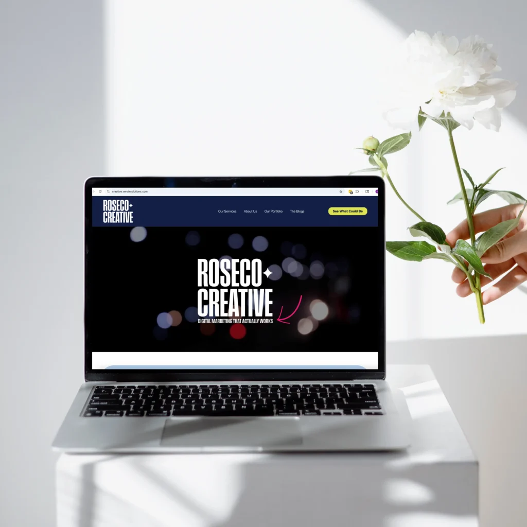
Our original website was built when RoseCo was still in its early days. It used our old branding, it was thrown together fast, and honestly, it looked like a starter site. At the time, that was fine. It got us online.
But as the business grew, the site didn’t grow with us.
We were creating high end brands for clients, building beautiful websites, developing content systems, and running ad campaigns that were generating real money. Meanwhile, our own website still looked like something we made during a late night coffee sprint just to “have something live.”
It didn’t show the caliber of work we were producing.
It didn’t communicate our personality.
And it definitely didn’t reflect the premium experience we provide for clients.
We had evolved.
Our site had not.
So we rebuilt it from the ground up.
Our Solution
We designed a new website that finally matched our identity. High end design, modern structure, warm tone, and the kind of polish RoseCo is known for.
We created a digital home that:
Shows our brand
Deep colors, intentional layout, and a premium feel designed to match our real world work.
Shows our work
A portfolio system that actually highlights our clients and their results instead of tucking them away.
Shows our personality
Professional, but not stiff. Clear, but not boring. Polished, but still human.
And just a fun little note for you reading this:
If your eyes are on this page, you’ve already seen the website in action. You’ve literally experienced the finished product.
How We Did It
A Design That Actually Feels Like RoseCo
We built the entire website around our official brand palette deep burgundy, navy, chartreuse, and blue grey. The design feels intentional, organized, and modern. Clean lines, strong hierarchy, and visual breathing room make the entire site feel premium.
Nothing cluttered. Nothing rushed. Just clean, confident design.
Copywriting That Sounds Like Us
We avoided the typical agency jargon and wrote exactly how we talk. Simple. Direct. Smart. A little witty when appropriate.
We wanted the tone to feel warm but professional, helpful but confident. Clients should be able to read a page and instantly think, “These are real people who know what they’re doing.”
A Portfolio That Finally Does Our Work Justice
One of the most important parts of the rebuild was giving our client projects a proper home. Now, each portfolio page:
- Explains the client’s problem
- Shows our solution
- Walks through our process
- Breaks down the results
This structure proves our value without overselling it.
Conversion Focused Layout
Everything was designed to lead visitors toward the next step, whether that is booking a call, learning about services, or exploring the portfolio.
Clear sections. Clean navigation. Predictable paths.
No mystery clicking.
No walls of text.
No fluff.
Fast, Stable Development
The backend was built to give us full control. The site loads fast, works on every device, and allows us to update content as often as we need to. When RoseCo grows, the website grows with us.