Modernizing a Thirty Year Legacy Without Losing Its Roots
The Client’s Problem
Brandon Development has been a cornerstone of construction in Brevard County for nearly three decades. Their reputation was earned through consistent craftsmanship, strong leadership, and an unwavering commitment to excellence across commercial, industrial, medical, aviation, food service, and high end residential work.
But while the company kept evolving, the brand did not.
Their original branding no longer matched their real capabilities. The visuals looked dated. The colors felt muted. The typography had no structure or personality. And the overall identity didn’t communicate the scale, precision, or professionalism that defines the company today.
This wasn’t about vanity.
It was about alignment.
When a company with thirty years of experience looks visually behind the times, it quietly — and unintentionally — undercuts its own position. Brandon Development needed a brand that honored its legacy while expressing the strength and sophistication of its current and future projects, especially as they expanded deeper into aviation development at MLB Melbourne Orlando International Airport.
They didn’t need a new identity.
They needed a refreshed one.
Our Solution
We delivered a complete brand refresh that elevated the look and feel of Brandon Development without changing the core of who they are. Our goal was to refine, modernize, and clarify the brand while preserving the stability and trust the company has earned over decades.
The refresh focused on three key areas:
A strengthened visual identity
More structure, more clarity, and a design language that communicates craftsmanship and confidence.
A modern color and typography system
Bold, architectural, and aligned with the industries they serve.
A unified brand story
Clear, professional messaging that speaks to their values integrity, excellence, and long term reliability.
With these updates, the brand became sharper, more authoritative, and finally reflective of the scale and prestige of the work they produce.
How We Did It
Discovery and Brand Alignment
We began with an in depth review of Brandon Development’s past projects, internal culture, client relationships, and long term goals. We studied their ideal customers, the industries they serve, and the way the company is perceived across Brevard County.
We identified a major gap between how the company operates and how the brand looked.
This became the foundation of the refresh.
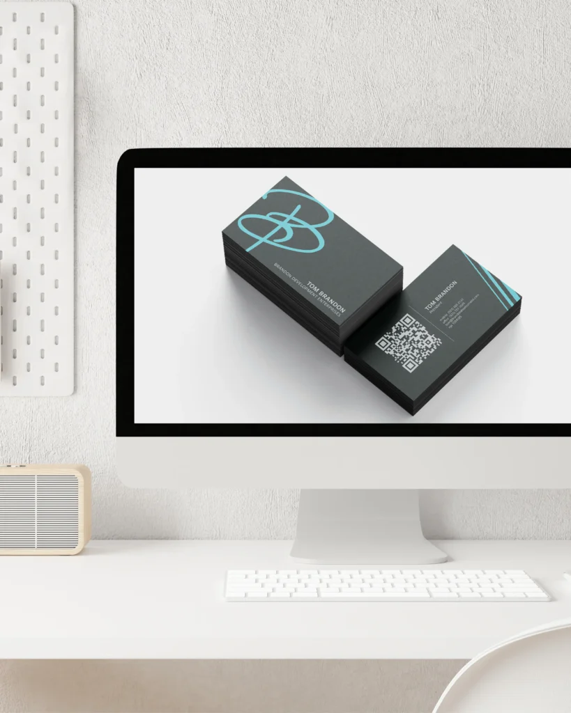
Refining the Logo and Identity System
Instead of replacing the logo, we modernized it. We balanced the proportions, sharpened the lines, and gave the mark a stronger visual presence.
The supporting design system was expanded with:
- A clean structural grid
- Modern spacing rules
- Consistent visual hierarchy
- Strong, architectural typography
This new system gives Brandon Development a predictable, organized, and professional brand identity across every platform.
A Color Palette Inspired by Their Industry
We built a palette rooted in deep navy, steel tones, and refined neutrals. These colors were chosen because they communicate strength, stability, and precision while aligning naturally with aviation, commercial, and industrial construction.
It feels timeless.
Not trendy.
And that’s exactly what a thirty year brand needs.
A Rewritten Brand Narrative
We redefined the language behind the brand. The new messaging clearly communicates:
- Thirty years of trusted leadership
- Multi sector expertise
- Commitment to integrity and quality
- A disciplined approach to construction
- A future focused mindset
The tone is confident, steady, and professional. It reads like a company that has proven itself — not one that has to convince you.
A Complete Set of Updated Assets
We delivered a full brand package including:
- Logo refinements
- Color system
- Typography rules
- Updated iconography
- Graphics for digital and print
- Brand voice guideline
- Consistent layouts for future marketing
Everything Brandon Development produces now carries one unified identity.
How It Worked
The refreshed brand immediately strengthened Brandon Development’s public presence. Partners and clients now see a modern, polished company that still carries the trust and experience they are known for.
The new visual identity dramatically improved the professionalism of their website, marketing materials, proposals, and digital assets. Their ads began performing better. Their content gained more credibility. And internally, the brand now reflects the pride their team has in the work they deliver.
Most importantly, the brand now matches the truth about who they are a strong, consistent, experienced contractor with decades of proven work and a clear vision for the future.
Brandon Development did not become a new company.
They simply look as strong as they already are.