A High End Marketing Identity Built on Purpose, Personality, and Serious Creative Firepower
The Client’s Problem
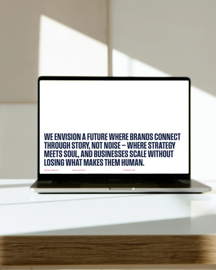
Before RoseCo Creative officially launched, the talent was there, the vision was there, and the work ethic was definitely there. But the brand. The brand had not caught up yet.
Stephen and Kylee were building something ambitious. A marketing company rooted in excellence, faith, integrity, and a healthy amount of Florida sunshine. But without a clear identity, RoseCo risked blending into the sea of forgettable agencies who talk a lot but deliver very little.
They needed a brand that did three things at once.
Look high end.
Sound human.
And stand out the moment it appears on your screen.
The challenge was simple.
This brand had to feel like RoseCo. Not generic. Not corporate. Something with personality, warmth, and a little wink at the end of every sentence.
Our Solution
RoseCo’s brand identity was built to represent who they truly are. A premium creative team that takes its work seriously but does not take itself too seriously. Smart, modern design on the outside. Deep values and razor sharp strategy on the inside.
The identity was built around five traits that define the company:
Integrity
The decisions, the communication, and the work all flow from a foundation of honesty.
Excellence
If it looks rushed or sloppy, it simply does not get published.
Tactical Reactivity
The brand needed to feel agile, not stiff. When clients move fast, RoseCo moves faster.
Warmth
The business is high end, but the people are approachable.
Creative Polish
Everything from the color palette to the typography needed to feel intentional and premium.
This gave RoseCo a brand that feels confident, clean, and capable of working with high ticket clients across industries.
How We Did It
Clarifying the Brand Personality
RoseCo was positioned as a high end creative partner that blends strategy with human connection. Not too stiff. Not too cute. Professional with a pulse.
The tone had to reflect how the founders actually communicate. Direct. Clear. A little playful. Never arrogant. The goal was simple. When someone interacts with the brand, they should be able to tell within three seconds that a real team with real personality is behind it.
Designing the Visual Identity
The visual aesthetic is undeniably RoseCo. Deep burgundy, soft chartreuse, navy, and blue grey blend together to form a color palette that feels premium without drifting into corporate monotony.
The logo is simple and sharp. No extra flourishes. No gimmicks. Just clean geometry that works at every scale from website headers to hats.
Typography was chosen with intention. Modern lines, strong structure, and a balanced hierarchy create a brand that feels organized yet creative.
Building the Brand Voice
If RoseCo were a person, they would speak with clarity, confidence, and quick wit. The brand voice needed to mirror that.
Short sentences. Conversational tone. Professional but friendly. A hint of cleverness. The kind of writing that reads smoothly and makes people think, “These people know what they’re doing.”
This voice now lives in their ads, proposals, website, captions, and client communications.
Creating a Scalable Brand System
A complete brand package was delivered so RoseCo could operate like an established agency from day one. This included:
- Logo suite
- Color palette
- Typeface selection
- Layout rules
- Visual guidelines
- Messaging pillars
- Brand personality outlines
- Templates for social, proposals, and internal materials
Everything works together in one unified system so RoseCo looks consistent every single time it shows up online.
How It Worked
The RoseCo brand became a core reason the agency grew so quickly. Clients immediately recognized the professionalism. The visuals made the company feel established. The tone made the company feel human. And the consistency made the company feel trustworthy.
The brand helped RoseCo win high ticket clients long before most agencies reach that level. It set the standard for their content, their ads, their proposals, and their communication. And it gave them a digital identity that matched their real world values.
Today, RoseCo Creative shows up with a brand that is polished, personable, and unmistakably them. It reflects the founders. It resonates with clients. And it continues to open doors for the agency as it expands across Florida.
RoseCo looks the part because it is the part.
And its brand proves it every time someone sees it.