A Modern, Elegant Brand Built Around Heart, Home, and High Standards
The Client’s Problem
Shaw Design Group came to us with a strong vision but no unified identity. Brooklyn, the founder, already had the talent, the passion, and the eye for beautiful spaces. She was building homes people loved living in. But the brand behind her work didn’t reflect the quality of her design or the level of clientele she wanted to attract.
The challenge was clarity.
Her style is bold, playful, refined, and deeply personal. Her clients needed to feel that energy the moment they saw her brand. Instead, the visuals felt inconsistent. The messaging felt scattered. And her digital presence didn’t match the sophistication of the interiors she created.
With the business expanding across Kennesaw, Acworth, Marietta, Woodstock, and Roswell, she needed an identity that could grow with her. Something modern. Something elegant. Something that communicates professionalism, friendliness, and artistic confidence in one clear voice.
She didn’t just need a brand.
She needed a brand that felt like her.
Our Solution
We built a complete brand identity centered around three ideas:
beauty, trust, and personality.
Brooklyn’s work blends clean lines with creative flair, so the brand needed to do the same. We leaned into a modern and elegant feel, layering in softer, whimsical elements to reflect her playful energy. This gave Shaw Design Group a style that feels polished while still being human and inviting.
Her brand voice became an extension of who she is. Energetic, passionate, caring, and creatively confident. The tone is approachable but professional, with language that makes clients feel understood and inspired.
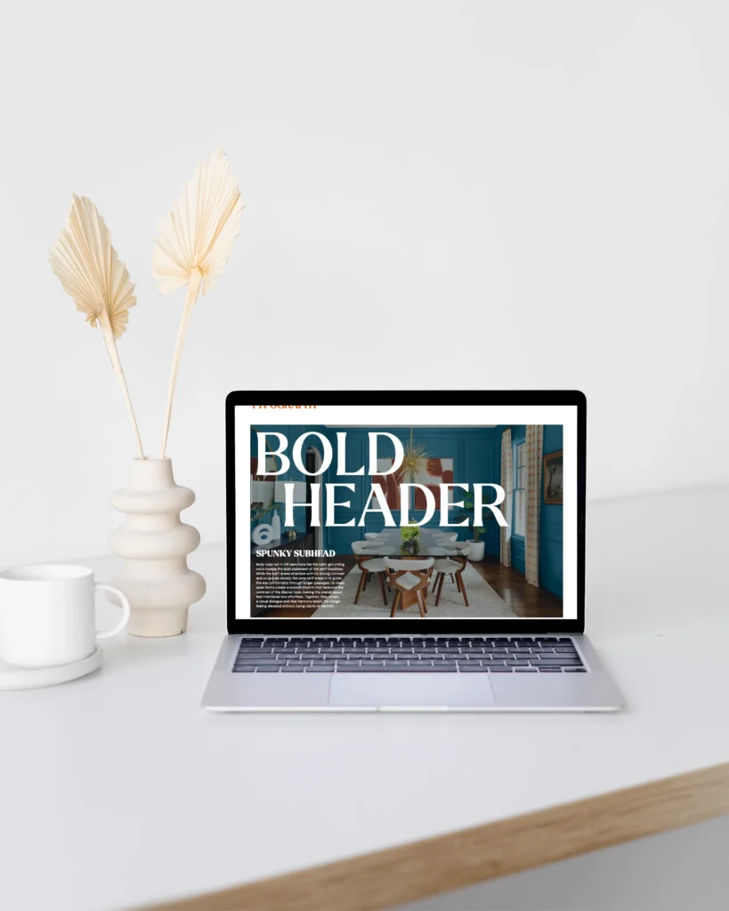
Visually, we created a brand world that feels like stepping into one of her designs. Teal accents, layered blues, and natural textures reflect the calming, beautiful spaces she creates. Florals, butterflies, geometric patterns, and light abstract shapes were added as stylistic touches to bring the full aesthetic together.
The identity became a blend of strength and softness. Bold enough to stand out. Gentle enough to feel like home.
How We Did It
Deep Brand Discovery
We spent time understanding Brooklyn’s story, inspiration, and goals. She builds spaces where life’s most beautiful moments happen, and that purpose needed to shape her branding. Family, growth, and personal connection became the heart of the message.
We studied her top professional values integrity, responsiveness, and compassion and infused them into both the visuals and the messaging. This ensured the brand felt truthful, dependable, and aligned with how she treats her clients.
Logo and Visual Identity Design
We developed a primary logo that feels modern and timeless, paired with a secondary mark that adds personality without clutter. The typography carries elegance and clean structure, making the brand feel high end in every application.
Her color palette shades of blue and teal was expanded into a full system that works across digital and print. The final palette feels fresh, calming, and elevated, matching both her personal taste and her design philosophy.
We also created a library of textures and illustrations that add softness to the brand. These elements breathe life into the visuals and make the brand instantly recognizable.
Messaging and Brand Voice
We built a verbal identity that reflects Brooklyn as a professional and as a person. Her brand voice is warm, confident, and lighthearted. It invites clients into the design journey while positioning her as the expert guiding them through it.
The messaging highlights her mission helping people love where they spend life’s most meaningful moments and makes her value proposition instantly clear.
Practical Application
Finally, we built out the usage guidelines, social templates, and brand materials that allow Shaw Design Group to show up consistently across every platform. Every piece feels unified. Every touchpoint feels intentional.
Brooklyn now has a brand she can grow into for years.
How It Worked
The new brand immediately elevated the way Shaw Design Group was perceived. Clients saw a company that looked polished, professional, and trustworthy. The visuals matched the quality of the work. The messaging felt genuine and compelling.
With a cohesive identity, Brooklyn now steps into conversations with confidence. Her website, social media, and client communication all carry the same elegant personality. People finally see the level of detail and care she brings to every project.
Most importantly, the brand now reflects exactly who she is bold, meticulous, creative, and inspiring. The identity isn’t made up. It’s an honest mirror of the woman behind the work.
Shaw Design Group didn’t just get a brand.
They got a foundation for growth.